+971-56-6256274
+971-56-6256274
Web Development Trends You Can’t Ignore in 2019

While hiring a web developer for your website, the first thing comes to mind is tons and tons of revisions. Why? Because most of the times developers don’t completely understand your concept and come up with their own idea to create a website that in most cases is not according to your plan.
With advancements in user experience and interface design, websites have become more efficient, smooth, and easier to use. In fact, UX experts say that websites that are simple are more likely to attract the users.
Awwwards, a website that awards websites based on their unique development and design, sets the latest standards for web development trends each year. It is perfect for anyone who is just starting to develop their website.
While starting the development, you don’t want your website to be complicated. That’s why it is essential to know the best website development trends in the market.
But before we get to that part, let’s learn a little about latest technological advancements and how they are reshaping the webosphere, especially why it is necessary to have a good website in 2019.
- Users will leave your website if it doesn’t load in under 4 seconds. Make your website using the latest languages that are fast, browser friendly and easy to program like React and Angular.
- Google prefers websites that have a decent design and load faster. You can add AMP pages for websites to make them load faster
- 50 percent of revenue for ecommerce websites comes from mobile devices.
- Current technology used in website development in 2019 is HTML5 and CSS3.
In this article on custom web development trends 2019 you will learn:
- Make websites faster, simple and attractive by learning about the latest website development trends in 2019
- Attention span is pretty low, so focus on bold fonts that provide meaningful content otherwise users will simply close your website
- A website will only rank in Google if it is filled with relevant content. So make sure your website has proper content and is optimized for SEO. Focus on On-page SEO for starters.
- Make your website in such a way that it makes the user journey flawless
- If you can decrease page load time from 8 seconds to 2 seconds, your website will see an order growth of 72 percent, according to a study related to ecommerce.
Note these takeaways. You will need them when getting your website ready in 2019. Now that we know the essential points about the necessity of new website design trends 2019 , now let’s see what some of the best design trends 2019 were.
Where is the Website Development Technology Heading?
There is already a lot of hype about how the web space is going to change in 2019. But most of these are simply made to confuse web developers. More or less, the web is going to remain the same except for a few changes in design and development. Let’s learn what they are and how you can learn them to stay above the trends.
List of Latest Web Development Trends And Technologies in 2019
Chat bots
We have been hearing about chatbots from last three years. These are some of the latest web trends and technologies this year as well. Chatbots are going to remain big.
Some of them will get even more refined but they are nowhere close enough to replace human customer support representatives. Most companies today are relying on chatbots governed by supervised machine learning.
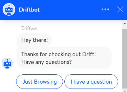
But developers of companies like Drift and a few other conversational marketing platforms are working fast to make chatbots intelligent.
These chatbots by Drift are just one example of how chatbots are beginning to understand human conversations.
Obviously they aren’t as smart as us humans, but they are still a great way to generate leads and expand businesses through many unthinkable ways.
Some companies like Mitsuku have gone even one step ahead by creating bots that can become friendlier to humans.
Adding Mitsuku to your website just to solve queries may be a farfetched idea considering that it won’t close the funnel, but these type of web designs surely get more eyeballs and keep the users engaged for long.
Progressive Web Apps (PWAs)
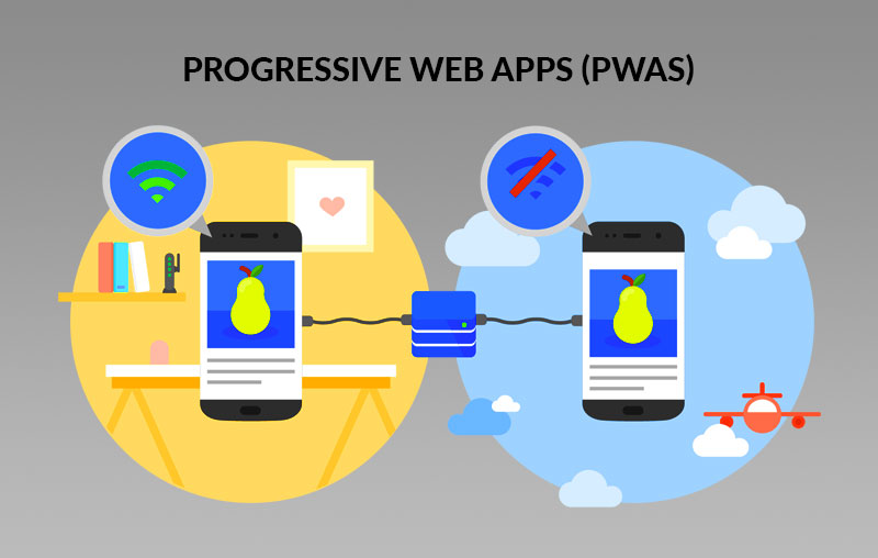
Well, it was 2015 when PWAs came to the limelight. But they are still relevant because not many people have any idea about how the web actually works and how they can make their website accessible on mobile as well. The PWAs work just like a website cum mobile app. This means you can launch the app without actually downloading it to your mobile.
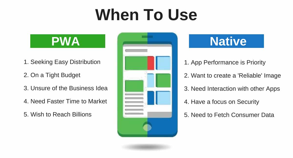
Another great thing about PWAs is that they can be easily developed using React Native, a JavaScript framework. Now that native app development is no longer a thing, PWAs can literally give your mobile app a new edge in the market.
Source: AppInventiv
As you can see, it is more like an app then a website. You don’t even have to install it in your phone to work. In fact, you can bookmark the website on your smartphone and it will work just like an app.
While creating your own website with the PWA framework, make sure that you focus on keeping the website simple and improve its speed, both at the same time.
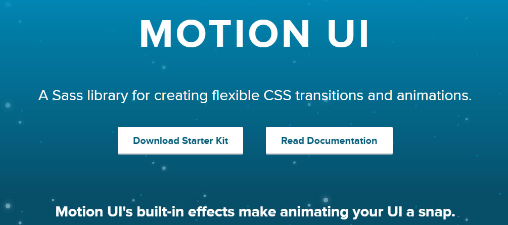
Animations and Illustrations with Motion UI
There are many libraries available to creating stunning website designs that not only wow the audience but also create value for the user. But they are difficult to program. Thankfully, there is a better alternative in the market – the Motion UI.
Here is what Motion UI does and what you need to know about it.
If you go on the Zurg website. For those who don’t kow about Zurg, it is the company that created the Motion UI library for HTML 5 and CSS 3.
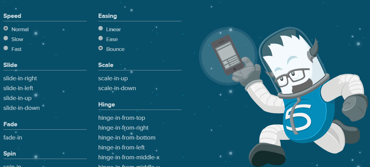
On the website, the company has offered a few functions that you can literally use anywhere on your website by simply copying the code.
The library can be used to hover in/out, fade in/out, jump in/out, hide/show things with some animations that look interesting to the eyes.
Most animators are confused about how they can make a name for themselves and become popular. The animations and illustrations used in websites are all made in HTML5 instead of flash because HTML is faster and lighter.
The purpose of each animation is to make the website look unique. Here are a few examples of people are adding illustrations and animations to their websites using Motion UI.
Should You Go For Animations or Illustrations On Website?
A big question among many developers is should they create animations in website designs or not? This brings us to the next part of the design concept: DON’T OVER DO IT!
But how will you know if you are overdoing a design or if it is perfect for business. The answer is: None. You don’t know if a design is perfect for business. You just try to bring it as closer to the design as possible.
As you can see, Shopify is using illustrations in a way to sell its own products. This is the best strategy that brands can use today.
Not only this aspiring for new graphic designers, but it also gives us content marketers a thing or two to improve the landing pages by adding creative illustrations.
Most of the illustrations used on website designs are available for free on websites like PhotoBucket, Shutterstock, Pexel, and many others.
What you as a developer can do is bring these illustrations to life using the Motion UI library. it comes with pre-set commands that you can use to make your website more attractive.
Single Page Apps (SPAs)
It is evident that most people don’t like multi-page website. They are only interested in getting their things on the web and SPAs also known as Single Page APps are great for that part.
The reason they are preferred by most users is that they are easy to create and they work similar to a PWA. The only difference is that SPAs only load a single page and all the action takes place on it.
While a PWA works just like a mobile app, except that you don’t install it on your mobile.
He has also explained the working of a PWA and why it is different from an SPA.
Content on SPAs is loaded dynamically and keeps the user engaged on the same page. In most cases, the page is using AJAX that brings dynamically loaded information from the server without actually loading the page.
Modular Design
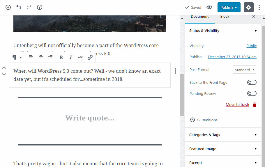
If you have seen the latest WYSIWYG editor by WordPress called Gutenberg you must have observed how it differentiates the copy from all other aspects. In fact, it gives complete liberty to the user so that user can easily create creating design using various modules and then ask for their feedback.
The purpose behind modular development of websites and content is that users can now make small changes themselves instead of relying on developers. This gives more liberty to the users and allow them to become more creative.
Modular designs are perfect for those who have a theme enabled on the website and would just want to change it. They can add more pages, custom options on those pages, and bring dynamic content to them without worry.
The purpose behind minimalistic designs is that they can easily process information and decrease redundancy in design.
If you have ever heard of the concept ‘less is more’ you will understand that design elements are way better way of depicting the design rather than the contrast and typography.
Similarly, we have Divi for WordPress websites that allow modular development. With Divi, anyone can create a custom landing page for his users without spending time and money on irrelevant plugins and services.
With its modular approach, users can easily add type of content they want to rank and how they want to do it. All this is possible with just a few clicks. No need to go digging in code anymore.
The designs make website navigation easy and provide accurate information to the user. This can lead to good user experience, enhanced CTA and higher page conversions.
Virtual Reality/Augmented Reality
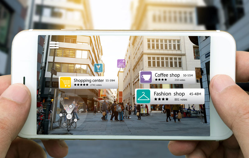
Virtual and Augmented reality have taken the world by storm. They have made so many things possible that were only a dream a few years ago.
Especially in the webosphere, they have changed the dynamics of learning, ecommerce, development and gaming. people now prefer virtual gaming because it allows them to actually feel how the game works. The augmented reality is making learning easier for people.
It is now used in industries around the world and helps technicians learn more on the job through assisted augmented reality apps. Coming back to our discussion around webosphere, ecommerce stores are embracing it.
Behavior Tracking Software
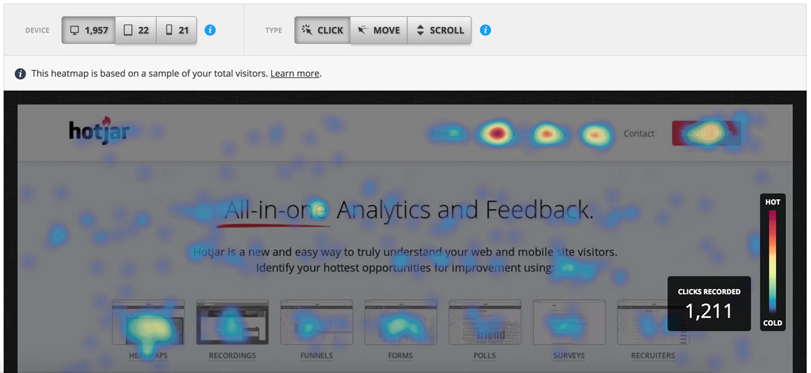
Now most ecommerce stores have started using analytics, we will be seeing more behavioral tracking options. We still have heatmap, visual charts, and other similar pattern recognition software but these are only active for some apps and websites. In fact, we used to have Google Analytics installed on our websites.
The software tells how many visitors have visited a particular website and for how much time. It has multiple tracking options that allow a website administrator to know the bounce rate of his website, active visitors, and the pages that get the most traffic.
Better Usability
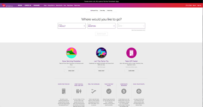
Virgin America always wondered how it could improve the user retention rate on its website, it wasn’t looking for a better Ecommerce Web Design Trends 2019.
An idea popped up in its mind. Why not simply ask the users what they want to do? And that idea was turned into a website that has pushed usability to a whole new level. The website has literally nothing except for a simply question and a series of answers.
Now if you are wondering why such a boring design for a website? Then the answer is: People don’t like flair and flavor, they like simplicity and problem solving designs. This website provides both.
It relates more with Conversion Rate Optimization (CRO) rather than the design of the website itself. This allows users to improve the whole website without compromising on the quality.
Undoubtedly, this has also increased the retention rate of their website.
Animations/Videos in background
One way to stop people on your website for a few seconds is by adding a new or different video that will retain their attention.
The animation and videos are not really bothering but they help the user understand what the product is all about. In fact, these are a great way to help visitors understand what a particular product or website is about. Boosted, an electric scooter company, is just doing that.
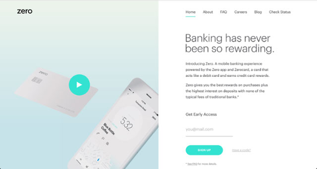
Then there are some websites that want people to understand a product through a video. This is also another great way to retain visitors. That’s what Zero is doing with its embedded videos on the home page.
Non-traditional Scrolling
Horizontal scrolling isn’t the traditional way to scroll but it looks good on some websites where the intent of the publisher is to make the user engage with the website.
The website is from the creator of Tetris effect. Since all others were using vertical scrolling for their website, the company wanted to do something different with their website. Brands that implement the horizontal scroll declare that their websites are a work of art, and the Resonair company signifies that.
But while following this design, keep in mind that not many people are used to this type of scrolling and most probably close the website if they don’t understand how it functions. However, you can teach them about the scroll through arrows and labels.
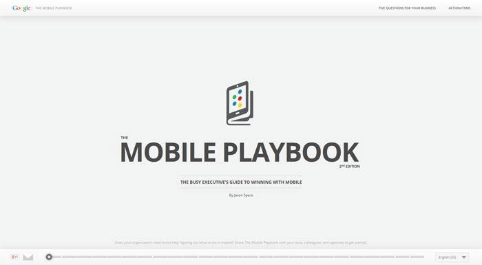
Another website that is doing the same is Mobile Playbook.
But that website has added additional navigation options to make the user understand how the website pages work. See the scroll menu at the bottom of the screen. The pointer will move when each page of the website is scrolled.
It encourages users to explore the website and see the areas that interest them. It also helps them to jump to the section of their choice by a single click. It is found that websites that have scroll options available are read more and engage more visitors.
Scroll Triggered Animations
Scroll triggered animations is a new trend in the design industry. These type of designs make the content digestible by breaking it into multiple segments. People who have business websites can easily utilize the scroll triggered animations to make their products easy to understand.
These type of designs create smooth transitions between content on the website and graphics to create satisfying user experiences.
One of the best use cases of scroll triggered animations is Interactive by Al Jazeera. Most stories published on Al Jazeera use scroll enabled animations to make the readers understand the story even before they get to the actual story page.
Apart from that, businesses that have a product with multiple use cases or industry usages, can also opt for scroll enabled animations. They can break each use case of the product by fold and depict that through scroll based animations.
This is the badass shoes website. When you scroll down, it will burn the dollar and display a text message instead.
Adding these scroll triggered animations to your website is a hard bet if you are not familiar with development. There are certain libraries like Scroll Magic that can get the job done fairly easy.
FAQs about Website Development Trends
If you are just starting to create a website then you need to know about the top website development trends in 2019. Everybody wants to know how to become even more senior and get to ask a salary that you want.
But don’t worry, even if you lead a job, if you are someone that want his website developed again from scratch, then here are a few questions you might be wondering.
Q1. Should latest website development trends in 2019 to follow?
On an average, websites change their designs every three years or so. But it isn’t a clever decision to always follow the trends. Instead, ask yourself these questions:
- Will my audience like the new site?
- Does the design resonate with your business?
If you are not sure that the people will like the new website design in 2019, then simply do an A/B test.
Q2. What type of web development technology will work best for your website?
There are two ways to find out what type of development technology will work best for you.
- Visit Awwwards website and find out what are the latest trends in the web design and development. You can also read more about it on their blogs. There are also many blogs that compare the development trends that are going to go big this year.
- Check out your competitors and see what type of latest website development trends in 2019 they have. If there current design is aligned with their conversion goals, probably it is a good option to move to use a similar one for your website.
Q3. What type of features should I add to my website?
Again, this is your call. You can add as many features as you want such as smooth scrolls, animations, transitions, and even simple designs. But make sure that features are liked by your website audience/customers who will be engaging with your content and products.
Final Word
That’s it for the top website development trends in 2019. Make sure to read the FAQ section and analyze what type of design. Will best fit your needs.
Good luck!











1 Comment
Finally someone said it “they are nowhere close enough to replace human customer support representatives” for chat bots.