+971-56-6256274
+971-56-6256274
How You Can Boost Your Sales Through a Responsive Web Design

Getting the next big website designed for your product sounds like an easy task. All you have to do is reach out a mobile web design, pitch them your big idea and watch them do the rest for you! Isn’t that the real deal?
Well,
That sounds like an interesting way to get the most done for your online business.
We now live in an era where smart technology has taken over the world.
More than 80% of the global audience interact with mobile responsive websites and other internet services using their smartphones.
Half of the websites in the world are commonly accessed using a smartphone.
But, do you think getting a mobile responsive web design is good enough for your business?
Here we take out time to enlighten how you can boost online sales with a responsive web design that actually converts visitors into potential customers.
So without further Ado, let’s begin.
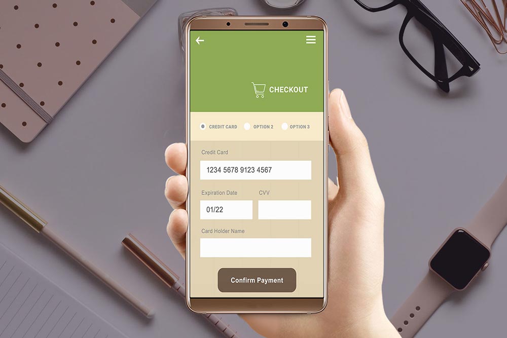
A Mobile Responsive Website Should Have a Mobile Friendly Checkout Form
What most customers don’t prefer when they are surfing the Internet on a smart device are painstakingly long checkout forms that they need to fill in order to make a purchase.
Whether it is a service or a product that you are offering to your customers, do make sure that your website forms are not complicated or incredibly lengthy.
Make it a hassle-free solution because most of the audience doesn’t enjoy going back all the way and correcting spelling mistakes or sorting invalid information fields.
To give your audience the best experience, make sure to design easy to use forms. Also, make sure that they are not elaborate and yet cover up all the necessary information required.
Add a Relevant Box Sizing Code to Your Responsive Website
Websites that are similar with design and content in the mobile version as they are in the desktop version creates a strong level of authentication. It urges customers to place their faith in the product/service which they are about to purchase.
There are several design elements which are involved when it comes to website development. Box-sizing is one such way that does the trick of making your website elements responsive.
You can use box-sizing on any element of your website by setting a width set in percent and it will automatically take the padding into account. Hence, you won’t require to adjust the width irrespective of whichever device you utilize to observe your website.
Just add the following div to your responsive web design code.
This trick works best for mobile websites and those which have a browser CSS3 support.
Add Maps instead of Address Fields to Get User’s Location Automatically
As a customer, one thing that we all despise is entering down our address when we are checking out from an online store website.
It is a cumbersome task and creates difficulty for both, the seller as well as the purchaser to identify where the customer is located.
Hence,
One way of winning the consent of your visitors is to provide them an option to pinpoint their location when they are checking out from your platform using a mobile device.
You can integrate Google Maps or some other Map application of your choice taking the friction out.
Note: Also, it will be wise to leave the manual address option available, just in case if someone isn’t able to pinpoint their location using a map.
Customize Push Notification Options to Give Your Website a Good Boost
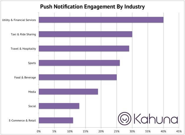
If you want a conversion boost, then customize your push notification. Push notification sent at the right time can really get your business, the talk of the town.
According to research performed by Kahuna, more than 40% of the CTR (Click-through rate) comes from push notification. Don’t just buy my word for it, see it for yourself:
Each push notification can be customized based on each customer’s app usage history.
Google Now Prefers Responsive Web Design over Normal Web Designs
Google prefers responsive web design over normal web designs because it doesn’t have to face any duplication error when it comes to website indexing.
Two copies of the same website can (one separate for mobile and one for desktop) can result in causing interference in ranking.
Besides, redundancy (duplication) can ultimately result in bringing the user’s website ranking factor down the Google list.
With a responsive design, a user can create a single website which can work both ways (on mobile and on the desktop) with the same URL.
It also has an adaptive HTML.
Responsive websites are also a better choice because Google can avoid crawling a number of web pages in order to accurately index the website. The possibilities of your website to rank higher incredibly increases shooting your success ratio head and shoulder above.
Take a Content First Approach While Devising Your Responsive Design Page
Two essential aspects that you need to address while shifting your online presence to a responsive design is
1) Content of your website is the most vital part of your strategy
2) Content is the important asset which reflects a strong UX
Ask yourself, what is the primary function of your website? It is to grab the visitor’s attention and convert them into a potential lead.
While an appealing design can win the consent of the visitor, it will still require a bunch of words to grasp their attention permanently.
When you create content for your website, make sure that it is mobile optimized. It means that the content you publish on your web pages is short, to the point and attractive.
Keep Your Responsive Web Design As Simple As Possible
Simplicity is the key to success! How many times have we come across this phrase? For any website to turn into a success, it is important that the website’s aesthetics are as appealing to customers as possible. But, is having good aesthetic just about everything?
If you want your website to become the talk of the town, it is important that your website usability is simple and not irritating.
In case, visitors surfing the Internet comes across your website, you need to make sure that they don’t get frustrated and walk away from the homepage.
A website with good usability will make sure that your customers can experience an enjoyable buyer’s journey. When websites are complex in navigation or have a clutter of information, then they ultimately end up in a mess that no one wants to be in.
A Website Without Distraction Easily Convert Visitors into Customers
When was the last time you visited a website from your smartphone? Was it yesterday or maybe today, a few hours back.
How was your experience? I am sure if you visited a renowned web platform, the experience would’ve been a par excellent one with minimal distraction.
When a website has less distraction or elements that can disturb their focus and attention, it becomes relatively easier for them to make their pick. By offering too much to the customer can send them into a mind-boggling situation often leading them away from their purpose.
Surely, you held the best intention to offer them all which you can at commendable discounts, but here’s what really happened. Instead of purchasing what you had to offer, their mind evaded from the possibility of purchasing which led them to your website in the first place.
Not So Sure Whether It Will Work or Not? Here’s An Example
One cannot be truly sure whether responsive website design will actually work for their small business or not and if you are having double thoughts, let me help you by giving an example.
A renowned tie selling firm, www.skinnyties.com, when shifted their website design from a simple to responsive one back in 2012, they experienced a great impact on their sales.
Just shifting to a responsive version not only solved their technical issues, but also skyrocketed their conversions to a whole new level.
Here are some results that will open your eyes in wonder:
- SkinnyTies observed a decrease in bounce rate by 23.2%
- Their website visits increased up by 44%
- The overall site conversion ratio went up by 13.6%
- iPhone conversions alone accustomed a total of 72% sales
- In time, the revenue growth for iPhone went up to a remarkable 378%
Does Your Website Have a Responsive Web Design?
When was the last time you planned on starting your own small business? And when you had that big plan in your mind, I am sure you didn’t pay much of an attention to whether you should go responsive.
In case, you have an existing business website, check in with your developers whether your website is a responsive design or not.
Time to Upgrade Your Website
First things first, if your website isn’t a responsive design, instead of spending thousands of dollars to get a complete redesign, ask your developers to shift your website to a responsive theme.
If you are using WordPress for your website, the process can be a whole lot simpler for you and even you can change the theme yourself.
Run a Test on Your Website
Once you have upgraded your website, it’s now time to test the new design and check how it works on the Internet. To test your website, you can make use of the Google Page Speed Insights tool.
It is a great tool and provides you credible information so you can fix different elements and make your website fast and responsive.
It’s Time to Index on Google
Last but not the least, when you are done with upgrading and testing, it’s time to get your website crawled. Search your web domain on the Google’s Search Console and just sit back and wait for the website to be indexed.
You may not see your website on the first page unless you optimize it with the right keywords, but it will surely move up the ranks compared to those websites which have outdated or unresponsive web designs.
End Note
A website is your online asset that leverages the power of branding and advertising to generate sales for your business. While, the look and feel of a website is of prior importance, it doesn’t necessarily need to look good if it doesn’t load on a smart device in time.
In case, if you are offering a frustrating experience to customer logging into your platform from a tablet or android, you are ultimately causing your business a potential loss worth millions.
You of all certainly don’t want that to happen now, do you? I believe not. Get your website analyzed and make it fully responsive. Let’s not waste any precious time, every second can cost you almost 10 potential customers or even more.


