A logo is a small sign or a symbol that is used by a company to represent its products and services.
If you are running a business in the UAE, then it is mandatory for you to have a creative logo design. Simply explained,
UAE is globally known as one of the fastest moving countries in terms of living standard, tourism, business and architecture. There are over one lac businesses currently running in the UAE. The important thing is to create a distinction between those businesses and your business.
Well, that’s not too difficult. If you have already planned for the business strategies, then invest some time in considering logo design ideas for your business now. A unique and creative logo will leave a lasting impression on the viewer.
The top-notch companies in the world are not just known for their services but also unique logo designs. An example is of the company “Apple” whose logo design, when it came, was an ultimate trailblazer. Its logo designer Rob Janoff is still known for his work.
In this article, I will discuss the best logo designing ideas that will give your business a fresh beginning in the UAE.
Why is a Professional Logo Design So Important?
A logo is the most viable representation of a business or a brand. Yes, it’s true that the size of the image is very small, but it contains your entire company.
A logo defines who you are and what you do.
You should also use SEO to build your brand signals and expand your business.
How Many Types of Logos Are There?
Before we dive into creative logo designs to understand more, let’s go through the types of logos first:
1. Lettermark Logo Design
Let me give you a simple example first:
Got an idea now?
A lettermark logo design is one in which the initials represent the entire brand.
In the logo above, just one letter has been used, but the elegance of the design makes it look amazing. A simple example is of BBC, where the initials represent the entire company.
2. Wordmark Logo Design

A wordmark logo is the one in which graphics don’t do the job of conveying an entire message. In fact, the complete company name’s text is used as a logo. Coca Cola is another popular example for wordmark.
3. Iconic Logo Design
Iconic logo designs represent both, what the company does and what it stands for. You have a combination of graphics and text in these sorts of logos.
4. Brandmark logo
Image Credits: Deluxe
These logos are different from the rest of the mentioned categories. In a brandmark logo, a strong graphic is used that depicts a part or the function of the business.
Let me give you some logo designing tips and tricks to create a brandmark logo:
- Merge your Vision and Mission to know what you want
- Study your business to identify needs
- Browse through multiple sites to get a bunch of ideas
- Look for other businesses in the same industry
- Don’t overwork
How to Design A Logo For Business:
Keep it Simple
If you have too many ideas, then stop right here! Take out the best one and work only on it. Adjusting too many logo design ideas for business in a single logo will exaggerate and magnify it, making it look least attractive.
Work on the Color Scheme
This element is more important than the design of the logo itself. Working on the color scheme is as important as working on the texture on which it has to be applied. A color scheme is a reflection of how quickly you want to grab attention.
Keep the Text Plain
The logo surely wouldn’t just be a small picture that one will see but will also contain some text. If you want to embed your company name, then try to use it in a way that it doesn’t overlap with the image. Moreover, an important thing is that the text should be visible.
Be Clear with Your Requirements
Work on the design that you have decided to go forward with. If you are taking logo design services in UAE, then make sure you clearly explain the color scheme and the kind of design that you want.
It is recommended to follow these Arabic digital marketing strategies to grow your business in UAE.
Here are 20 Logo Design Ideas for Business:
1. Thunderbot by Stevan Rodic
This logo is a perfect example of how a plain logo should be. Designed by Stevan Rodic, it can be seen that it is simple in color and has just one single image in it.
The quality of this logo is that it projects one single idea. Logo independently does not project exaggeration of any type.
Moreover, it doesn’t even have any text inside which means that the text can be used outside of it.
2. Financial Company by Anita
If you are from the financial sector of the economy then you surely know the importance of staying relevant and to the point.
The Cardinal logo is unique owing to its simplicity and the message which it wants to communicate. It can be seen in the below logo that the designer has communicated the goal of the company very clearly.
Instead of choosing to be more creative, the designer has played with simple text and added a small image which has overall given a decent image of the company.
3. Personal Mark by Bardh Kryeziu
Sometimes people like to mold business names into logos by going very short. The same theory has been applied here. The first letter of the brand has been used and colored in the logo. The designer has used vintage colors and kept the design of the letter very simple.
This logo is a good example owing to its uniqueness and color scheme. This example is just one of the many logo design ideas for business that exist on the web.
4. William Gray by Paprika
This logo is a trailblazer owing to its classic style. One can see that the designer has flirted with the two initials in a very creative way.
Moreover the use of gold color has added more fuel to the fire. The logo looks elegant in its way. If you are planning to open a wedding business in UAE, then this style is a must to consider.
5. Personal Identity logo by Ben Griffen
The idea of using the first letter for a logo went viral a few years ago. Personal identity logos are different because they are minimal in terms of text adjustment. Moreover, the color tone in the logo has been adjusted in a way that it doesn’t overlap with the letter.
Blue and orange, both the colors are one shade lighter than their darkest versions. This combination has glittered the logo.
6. Penguin Love by Ahmed Safwan
Are you a penguin lover or running a company that works for their welfare? Do not miss the opportunity to think over the logo below. The logo below is a simple yet very convincing idea.
The designer has used one simple image that depicts a penguin’s face along with the name of the company in small letters. The balance has been brought in by adjusting the text color with the color of the penguin image.
7. Greek Methodology Logos by Zach Tyler
The logo below is one of its kind. You will seldom come across many ideas that project a logo like this over the web. You can see how a roosters pic has been set adjacent to the text.
The beauty of this logo is that everything has been balanced out well. The chosen image of the rooster is looking towards the text.
So in this way, the logo is a trendsetter in its line.
8. BR Monogram by Dick Blacker
Looking forward to getting extra classy with your business logo? Let me help you with the exemplary logo below. The ethos behind this logo is a reflection.
The single letter has been used in both of its forms, capital and small. The color scheme is black and white along with one single letter.
9. Animation Langu by Studio Graphene
This logo is highly creative and has its fashion statement. The name of the company has been embedded by the designer in the middle of the picture.
Along with that, you can also see that the color tone is black and white, which makes it look simple but very attractive.
Logos of these kinds are often used by spas and massage centers where lifestyle and body matters.
10. Rooster Roast by Inspirationfeed
Let’s talk about the rooster again. Do you run a food chain in UAE or are planning to do so? Well, then you have a very good example below. This time we have a bigger test and an enlarged photo of the rooster.
This is a very good idea for a food chain owner. What do we think of when we see this logo? Food and tasty chicken, right? Well, you can proceed with a creative idea like this when designing a logo for your own business.
11. NSM Monogram by Jorge Ros
Sometimes the name of the company is too large to fit in. So what do we do then? Yes, we do walk the extra mile to make it happen.
The same ideology has been well played in the logo below. NSM are initials of a three word company name. If you would have originally gone through such logo design ideas for business then you would have noticed that such designs are used by businesses very rare.
The designer has very creatively adjusted the first letters as capital letters in a sophisticated way. Moreover, the use of light color has balanced the effect of a long name.
12. Swan by Yuri Kartashev
Sometimes a picture speaks louder than words. In the logo that we have here, the beauty lies in the mixed color scheme along with a simple image that does two jobs.
The first thing is that the image of the swan has been dissected and arranged in a way that once can get a clear idea about “s.” Secondly, the image itself tells us the name of the animal. Moreover, the color tone for the logo is a mix of dark and bright colors which give a slightly glowing look.
13. Sixth South by Jay Fletcher
Here we have a very different idea in perspective. The name of the company is “Sixth South.” This is one of the best logos that you will see on the web. Six images of sailing boats have been designed in a way that they look beautiful over the text that lies below them.
The logo has been completed with decency, uniqueness and a good color scheme. Many logos are often an exaggeration of several color schemes which only spoil the look at the end then.
14. Hikoma by Maskon Brands
Do you have a multinational business? Then you are just over the correct example. The logo below looks like a Chinese company with a modern touch. The highlight of the logo is the main first letter of the company that has been inscribed in red color.
As for the text it has been arranged in the distance below the image. This logo is also a good idea for a restaurant or any business that wants to locate in Dubai from a different region.
15. Tin Star BBQ by Steve Wolf
Are you from the food industry? Then you surely would have guessed that yellow color is often used by many companies of the same genre.
The yellow colored logo with a pig’s picture in between calls for a good food party. If you want logo design ideas for business in the food category then you must not miss any chance of researching on this logo.
If your company likes to enrich the customers with great experience within the banter of the rules, then this logo is a must for you to keep in mind when designing your logo. The color scheme of dark yellow and brown, add up with the rightly styled text to attract the audience.
16. Dove by Steve Wolf
Convinced with the logo design below? Well, yes it is a statement in its way. This logo design is unique because of the image that has been sed. The dove’s feathers can be seen to be adjusting within the frame of the logo well.
Along with that, the right color choice is making the design look very appealing. In case bright colors would have been used then the logo would have got exaggerated. Moreover, the addition of text would have spoiled the things.
17. Logo Collection by Igor Khrupin
Are you obsessed with vintage designs? If yes then the logo below is a visual treat for your eyes. This kind of logos were often seen in films from the ’80s and ’90s which had motels at every side of the walk.
Guess what?
The trend is coming back again. The millennials are opting to go for designs that are older but yet are attractive. You have one such example below.
The logo has a simple text and a plain image. The text and image are both from the same genre.
18. Lettering logos by Anton Popov
Checked the unique logo below? Well, the designer has very brilliantly carved the logo in a way that it gives a minimal message in the best way possible. A logo should be that which conveys much information with a precise representation.
Such logos are often used by printing press companies where they choose to go less creative and more upfront in terms of the design.
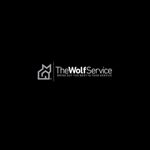
19. The Wolf Service by Brands Formed
Noticed something different?
So did I.
The design of the logo speaks for itself. The black and white combination is a smart move by the designer. The logo has a small picture of the wolf which looks perfect.
In case red or orange color would have been chosen, then the logo would have given a different vibe.
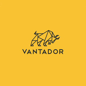
20. Vantador by Aprile
Inspired by class and style, this logo gives a very professional appearance of the company. Well, that doesn’t mean that the logo designs above are any less, but the use of bull’s picture is not very common for use in different logo designs.
Lastly, yellow color wins the audience with capital text.
I am sure that you would have got an idea about the logo design ideas for business by now. All logos above are unique in their way and completely differentiate from one another.
One thing is consistent with all the ideas given above, and that is the quality of the logos. None of them is exaggerated in terms of color, idea or text.
The logo is just a small part of the business but one that has a long-lasting effect. If you want to contact a logo design company in Dubai, then it is better that you ask them for suggestions too instead of only explaining your requirements.
While you are getting a great logo for your business, make sure you also optimize your website for lead generation to get maximum customers.
Conclusion!
The tips and techniques mentioned in the article cannot be followed alone. In case you have consulted an agency who will do this work for you then you’ll have to explain some important things to them.
There is no particular barometer to measure the acceptability of logo design; what matters is how confident you are with your choice. Everyone will have their take on the logo design, but once you are clear on what you want, then you are good to go.
Color, design and text will easily make up any logo, but the main ingredient is the message that you want to communicate. Your logo design ideas for business will surely help in presenting the business in the best possible way.
So don’t be worried, just go on.




1 Comment
This post showed very good understanding and it was well-thought out work. I’m obsessed with reading any article for help I can find. Thank you for sharing.