+971-56-6256274
+971-56-6256274
17 Latest Graphic Designing Trends To Grow Your Brand Awareness
With New Year only a few days ahead, it is the right time to familiarize yourself with the modern graphic design trends that are soon going to become popular.
While graphic design advertising is one field that has always enjoyed freedom on the internet, recent regulations and standardization of practices have made some changes to this liberty.
The good thing is that this has changed the quality for the better. Now, with multiple types of graphics design and consistent competition, graphic designers are always aiming to stay ahead with something unique, something creative that can keep the viewers engaged and inspired.
With that said, here are the best digital graphic design trends that you should watch out for in 2019.
1. Simplicity is Going to Rule
2019 is about decluttering the junk and focusing on quality. Not only in design and content, but also in data science and machine learning, everything is getting decluttered. The reason is simple, the world can’t have more junk in it.
This is where latest graphic design trends will take a toll. These simple and minimal design patterns not only clarify the message in the clearest tone possible, but they also engage, retain, and arouse the interest of the viewers.
Key Takeaways
- Focus on what user will think and how they will act
- Don’t design abstract concepts. Focus on problems and relate them to your design. That’s the only way to create an impact
- Don’t ignore the user journey because that will dictate the design of the web.
2. Gradients and Color Transitions are Coming Back
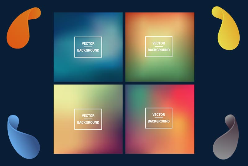
We have already seen many websites bearing gradient based patterns but they haven’t gone mainstream just yet. But in 2019, gradients and color transitions will see a significant rise in their trend.
With better design tools available, turning gradients to illustrations is just a point-and-click away. This means gradients are not only in vector but also take less size.
For all those websites and apps that are interested in bringing a ‘Wow’ factor to their appeal, adding gradients is certainly one powerful way to do it.
Key points
- Keep site speed in consideration when designing higher sized illustrations.
- Don’t overdo gradients and keep a mix of simple and color transitions
- Enhance the aesthetics of modern graphic design trends by continuous user feedback
3. HTML5 Animations & GIFs
While GIFs and illustrations are already in the market from a long time. In recent years, CSS3 and HTML5 based animations have emerged as a competition to these. Not only they are lightweight but also offer a better experience to the users on both mobile and websites.
But GIFs and SVG images are also not going anywhere soon. In fact, now that people are actively using social media, these Gifs and SVG images have become an essential part of the social content. Take Instagram, Facebook, or any other social media platform, you will easily find SVGs and Gifs on them.
Imgur and Giphy
In fact, Imgur and Giphy are a few websites that only survive on gifs. These gifs are then posted on Tumblr, Reddit, Facebook, and other social media websites. Another form of gifs that is becoming popular is cinemagraph. The cinemagraphs are images with only one or two objects moving in the background. They give a feel to the user that they are watching an animated image.
- While creating gifs is common on social media. Make sure to check if they are essential for your website. If an image or a video can take its place then replace.
- Gifs are mostly used to engage the viewers, when you want to explain a certain concept using gifs won’t suffice.
4. Bold Typography
While bold typography was once frowned upon. Today, it is necessary if you want to exist and want yourself heard. In fact, with so much content available on the internet, getting the attention of the users, even for a few seconds, has become challenging.
Designers are now opting for artistic effects, extra-large font sizes and huge headlines to get the grab user’s observation. The reason is simple, your products will only sell when users see them.
The bold fonts are not only easy to read but they dominate the internet marketplaces. See anywhere online and you will see bold banners, shouting product promotions.
But before you go about writing everything in bold, make sure to focus on these aspects.
- Use serif fonts. Serif font have recently made a reappearance on the screens.
- Serif fonts look great in print and also on many online publications. They are becoming more common online due to the recent development in screen density and light.
- With Google Web Fonts’ now having serif fonts, we will be soon seeing them getting restored to their pre-internet glory
5. Metallic Patterns
We are already seeing metallic patterns on most websites. These colors mostly relate to tech hardware. Companies that are involved in designing tech and telecom related hardware products use metallic patterns.
The trend for these metallic patterns will rise in near-future. Especially in 2019, we will see websites and mobile apps turning to metallic patterns for their layouts.
These metallic colors add depth and strength to the typography. In a way, they rejuvenate the websites and provide more sense of luxury and freedom to the users.
- Use metallic colors sparsely. Using these colors more than required can decrease the
- These colors will look great in ebooks, logos, and product display images. Don’t try to add them to page designs because that looks unprofessional and can lead to a distrust among users.
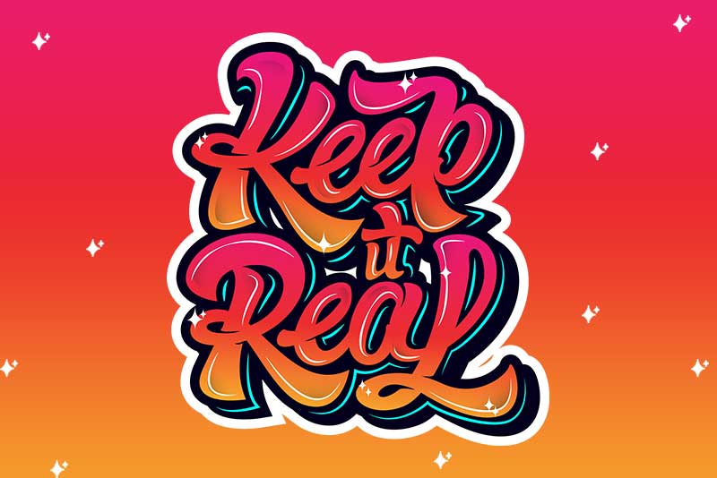
6. Hand Drawn Fonts will Remain Popular
Next we have hand drawn fonts. These hand drawn fonts depict rookies, amateurs, and are especially used for their websites in this era.
The reason people like hand drawn fonts is because they look innovative, illustrious, and are easy to make using various illustration software’s available in the market. They look original, innovative, and intimate.
That’s one reason they are going to be popular in 2019.
7. Unorthodox layouts will Rise
Abstract designs are becoming a part of our lives. Especially in the home design industry, the equivocal designs have not only garnered popularity but they have led to a totally different design theme known as transitional.
These designs blend the dark and light designs to bring a new energy to the objects. Similarly, websites now prefer these transitional and unorthodox layouts. In fact, Apple has used similar designs to design iPhone X and iPhone X layouts.
These unequivocal designs give a vivid imagination and depict an uncluttered design that goes without saying with any advertisement or web copy.
8. Radiant Energies/Cosmic Lights
One popular design that’s now becoming popular due to fast internet is of cosmic lights or radiant energies. These cosmic lights engage users for more than four seconds.
Especially if you have a design agency, then you can sky rocket engagement on your website by using themes with radiating lights.
The trend gained popularity in 2015 when internet speeds drastically increased due to 4G upgradation in many countries, people were able to load websites with heavy images at once.
Themes like Float and many have now emerged allowing store owners, bloggers to get these themes with just a few clicks and add them to their stores.
9. 3D Fonts & Shadows
Another type of designs that I suspect you have already seen in the market are of 3d fonts and shadows. 3D designs aren’t a trend in 2019 alone, they are already popular from some time. The reason behind their popularity is the rise in graphic processing and illustrations.
Especially with retina display sensors now available with Mac and iPhones, and true graphic sensors available on Intel monitors, watching 3D images in true colors is possible.
The 3D designs have gained special fame in the domain of gaming technology. The mix of shadows and rich colors attract users to play the games. You can see this in almost all gaming websites and even on websites that promote gaming engines like Unreal 3D and Unity.
- While 3D designing is great for websites, they are time consuming and require higher bandwidth to load.
- Instead of using 3D gifs, it is better to create 3D designs through CSS3 and jQuery.
10. Navigational Designs
Now that most apps make sure of GPS systems, navigational design is one other graphic design trend that is gaining popularity in 2018. We assume that they will remain popular during the 2019s as well. The navigational designs usually involve a navigation pointer and map.
In most cases, you will have it designed in a way that it mimics the viewer’s journey. Take a look at the website below.
Amcrest website offers navigational support services. This is the main webpage of the website. It is captivating and clearly indicates the services of the company. The website can use the same design with some changes in its mobile pages.
Similarly, check this GPS tracking website’s design. The design is simple and clear-cut. They have used the colors that most navigational apps use.
11. Amateur Photography
What do you see in the below image? An amateur photograph – mostly focused on sports events – and a bold fond with a CTA button.
Most homepages or the landing pages of websites depict the same scenario. Good thing is that it isn’t going away anytime soon. The reason? Look at that image again.
Tell me if it doesn’t give you an adrenaline rush. That’s an almost vertical descend from a mountain.
These type of images sell hot all across the internet because they make great backgrounds for most graphic designs.
Some more to get you interested.
12. Vintage Designs
If you remember, the art of manliness is one website that has this peculiar vintage design. It exists from a dozen years and has remained strong throughout. This type of vintage designs are evergreen and now many more websites with similar design are coming in the market.
For those who don’t know, The Art of Manliness is a blog that focuses on all things men.
Among other vintage design websites that are gaining popularity include, Forefathers.
13. Cinemagraph
We were just talking about how gifs and animations are changing the internet landscape. The cinemagraphs are no different. Made with the intention to make users believe they are watching a real video or animation, these motion-filled images play with the mind.
But the end goal of these images is to RETAIN. And, what is better than retaining users by letting them watch animations with slight motion?
The technique became famous in 2011, when a US photographer Kevin Burg used the technique to animate fashion shows in New York.
14. Brush Strokes in Designs
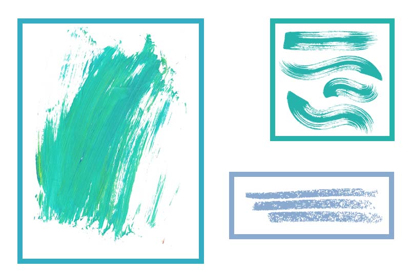
Artistic brush strokes signify continuity. That’s why most work of arts are made of brush strokes to signify that the picture isn’t yet complete and they have to add more details.
The same concept is now coming to marketing and web designing. Most graphics and web illustrations on websites now have these brush strokes. The designs look appealing, aesthetically pleasing, and have a sense of calmness to them.
These types of designs have also surged the demand of brush artists that use custom paintings for various companies.
15. Semi-flat with Shadows
Some other type of designs that have recently become popular – mainly due to mobile apps – are flat, semi flat, and material designs. They are going to remain popular in 2019 because the demand for mobile apps is increasing day by day.
Here are some mobile app designs that use semi-flat and material design patterns.
Material design by Google. The material design has become a defacto standard for Android apps.
Semi-flat designs use shadows and hues to differ themselves from material and flat design. These are used for both iOS and Android apps.
Both the type of graphic designs are popular among users.
16. Responsive Logos
Responsive logos are not actually a major graphic design trend, but more of a necessity in this time and era. These responsive logos started emerging with the responsive website designs and they are not the best logo design trends.
But, now that all website designs have become responsive and Google gives weight to websites that have responsive designs. So, responsive logos help these websites become more user-friendly through the various logo alterations.
These are not only needed for digital publications, but print and videos both can make use of logo variations of a company.
17. Louder Colors
In the past, tech companies restricted themselves to simple, nature-friendly, and soothing colors. But recently, louder colors are gaining traction.
These bolder and brighter colors have changed the way tech companies looked at design. Take Astra, Spotify, Netflix, and even Digital Ocean. These are some companies that use vibrancy to show uniqueness and make an impact.
Digital Ocean uses a mix of gradients and color transitions to make effective background layouts.
While Netflix has taken the basic illustration-based approach.
Both type of designs are bold and loud. They are not the traditional approach that tech companies used to take.
Bottom-line
Current graphic design trends are getting a constant change. We will be seeing a lot more changes in 2019 with recent developments.
Now that you know some of the most famous graphic design trends, take these approaches to create stunning looking designs for your website/app and market it effectively.
Key Takeaways
- Experimentation is the key to creating successful graphic design samples
- Don’t forget the power of customization. Make sure all your graphic designs have some personalized material that signifies your brand
- Focus on designing user experiences instead of following current graphic design trends
- Powerful illustrations are only helpful when they signify a purpose or help through the user-journey
